
26 okt Visual communication in research

The importance of visual communication in research
Written by: Lonneke Opsteegh
Researchers deal with complex information on a daily basis. Even the most applied scientific studies are complex in one way or the other. Maybe you have a very sophisticated methodology, use advanced statistical models, or combine enormous amounts of information sources. Simultaneously, we all need to communicate our research findings in journal articles, reports, popular publications, textbooks, conferences, patient information, or elsewhere. This means we have different audiences, from experts to layman, from elderly to children, and everyone in between. Finally, we use different types of media to communicate our findings; spoken word, digital and print, or maybe even exhibitions. Most researchers still communicate mostly in text, but visual communication can get your message out stronger, better and it will definitely stick more! As long as it is well designed, obviously…
This diversity in both audience and communication medium, requires us to tailor our message to the specific characteristics. But one thing is certain: humans process visual information quicker and better than plain text. Also, when you can visualise your key message, you are likely to be better at explaining it as well. As Albert Einstein once said: “if I can’t draw it, then I don’t understand it well enough” (ok, it might have been ‘if I can’t explain it, then I don’t understand it well enough’).
The interpunction of visual communication
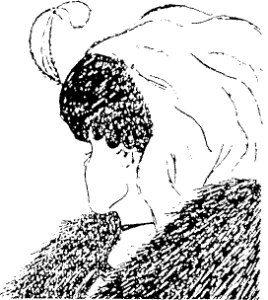
Visual communication has its downsides too. In written language, interpunction can make all the difference when it comes to the meaning of a sentence. This is the same for visual communication. Different people can interpret visuals in different ways, leading to confusion. So even though visual information might be easily processed, it is not always easy to design unambiguously – with interpunction so to say. We all know the example of the drawing of a young woman looking away. Or was it an old lady looking down? And what about the meaning of colour in different cultures? In western cultures red is connected to danger and action. Therefore, we often use it as an alerting colour. The meaning of red is very different in eastern (prosperity, good fortune and vitality) and Indian culture (beauty, wealth and power). The same holds for some other colours. Colour use can also be seen as a form of visual interpunction.
Visual interpunction might be the thing that is currently missing in your visual. When you write, you use paragraphs, comma’s, etcetera to make sure the mesage is readable. You can make certain sentences stand out more than others (exclamation marks) or create steps or lists in your text with bullets. In visual communication, this often lacks. All elements have the same hierarchical rank, making it unclear where to start and to find the most important message. Or there are just so many things to see in your graphs, that your audience drops out.
How to fix it?
Sharing your research results has, in general, one goal: you want to influence your audience. Whether they only remember your fantastic findings, change their daily behaviour or work procedures, or are only entertained, there is a reason why you communicate with them.
Design principles are the interpunction of visual communication. By taking these principles into account when designing your visuals, you can ensure that your audience reaches the intended conclusions and get into action. You visually guide them towards your key message by using lay out, position, colour etc.
Here some practical tips to get you going:
- Make sure there is some ‘depth‘ in your visuals. You can do this by using different saturation values for different elements. For example, i like to make benchmarks or targets grey and a thinner line thickness (in case of a line graph) than the actual data I’m looking at. Also, you axes are not really key information, so make them grey as well. Let your data stand out!
- Write a compelling title that guides your audience. We are used to writing descriptive titles (‘Number of XX per YY, using method ZZ and CC’), while you could also write a more conclusive title (‘method ZZ had the largest positive effect on X in group Y).
- Let your audience breathe. With other words: use white space and align as many elements in your visuals as possible. Try it, you’ll feel the difference.
- Pick the right type of graph for your data. To do that, try out different kinds and get out of your comfort zone! Are you focusing on a trend over time, on differences, relations between elements? Expand your graph vocabulary so you can communicate with the nuances that your findings deserve.
You talk about my ‘key message’, but I have several!
Fantastic! Let’s expand human knowledge with your numerous research findings! But when communicating, it is key that you have a straightforward and clear message to tell. So probably, you might need to work on more than one story. Finding your key message, and tailoring it to the needs of your audience, can be a challenge in itself. But our experience taught us that it will become clearer when we help you work on your visuals. We’ll keep asking difficult questions… The entire design process us iterative by nature, no simple step-by-step process unfortunately. No worries, we have your back and guide you through this process.
How can we help?
ResearchStories teaches you how to construct your story (or stories…), make insightful infographics, beautiful scientific drawings, or clear data visualizations and finally, tell your story to your audience in a way that they will never forget!
Check out our courses if you want to learn how to better communicate your research findings!